It feels great to compare old artwork to new pages of your sketchbook and see loads of improvement;
However, it’s absolutely exhilarating to acknowledge your growth in so many different areas while you’re in the midst of creating an illustration.
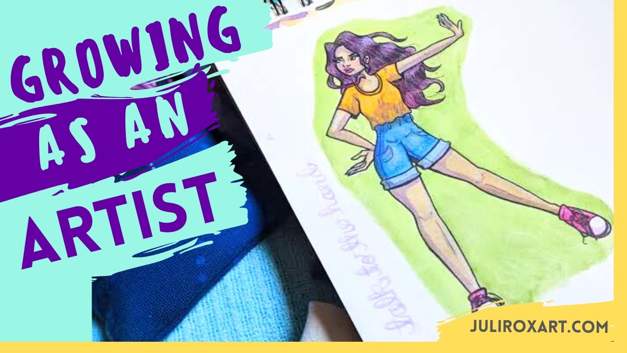
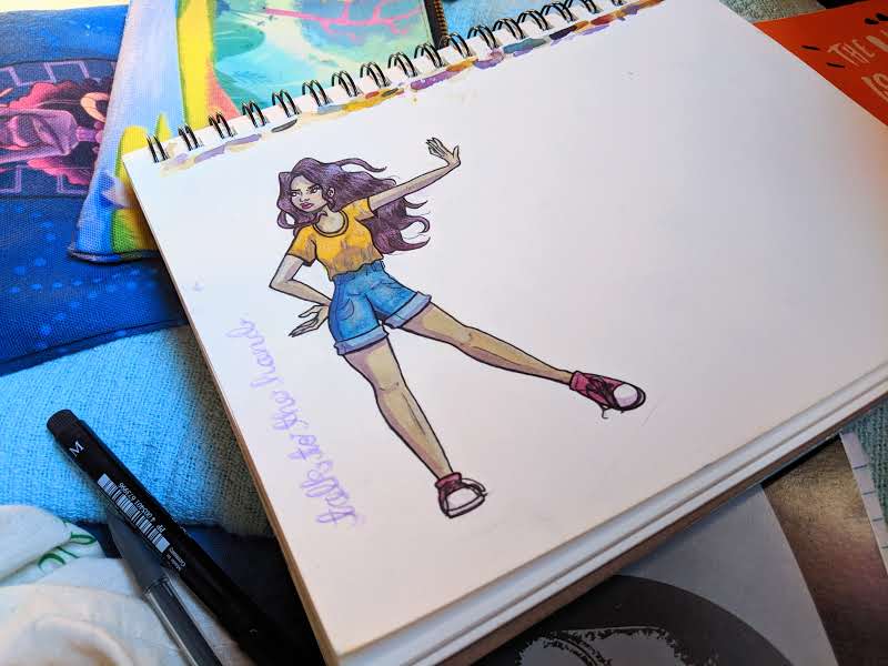
This is one of the latest pages in my sketchbook. Although it’s quite simple, it shows how far I’ve come as an aspiring artist.
First off, the pose.
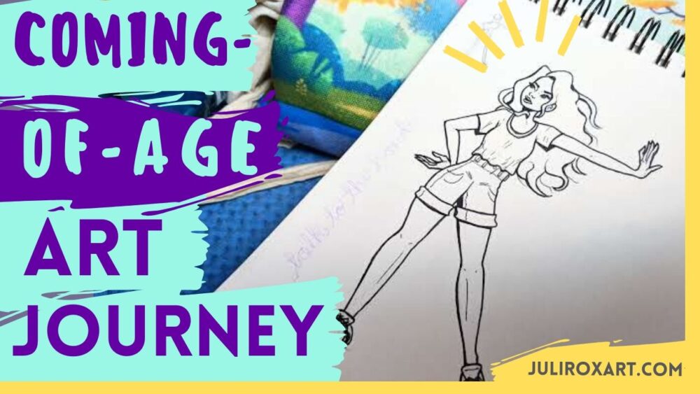
The characters that I draw are typically sitting or standing in a fairly stiff position. This illustration, however, was my first time drawing someone who gives off a sense of sass. This was what I was hoping to accomplish when planning this image out, and what I succeeded to do in my opinion. Once again, I didn’t find the need to pose awkwardly in the mirror to snap a photo as reference for it—instead, my hands moved on their own to create this.
Now, it wasn’t seamless, and took quite a bit of the usual erasing-and-redrawing; but, in the heat of the moment I was a lot quicker in getting the pose right. The only thing that gave me trouble, were the character’s hands, but this is nothing new for me.
Capturing movement has always been rather difficult for me; however, the weight and motion of this pose feels accurate.
Until recently, I’ve drawn characters’ faces as plastic smiles—something that I’ve only realized in retrospect—since it was the only way I knew how. But during my most recent character illustrations, I’ve really been pushing to create a sense of emotion. This is my first time drawing a character that isn’t smiling period. And although I’m not in love with her face, her irritated expression is clear.
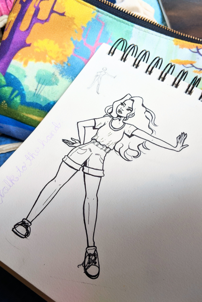
The line work of this illustration is my best so far. Rather than rushing through the first set of lines then going over them again with slightly more care, I took my sweet time. Every stroke was done carefully and with full intent—resulting in clean and bold line work.
This piece also displays my improvement of using watercolors (and my patience in actually waiting for each layer to dry. I love using my Master Markers set to lay down bold and flat colors; and have finally accomplished a similar look with watercolors as shown through Talk to the Hand (what I’ve decided to name this piece). I’ve also discovered the use of blues and purples to create shadows in my character illustrations. It gives my art much more depth and adds cool tones to even out the natural warmth of their skin.
My attempt at creating highlights in hair is improving as well. And while the Brazilian finger paint I purchased fails me on so many levels, it passes high on streakiness—the silver lining being that it can create decent hair texture.
I dream of the day where I can create an illustration with watercolors only—rather than relying on colored pencils to add texture. One day I will get there.
Talk to the Hand isn’t my favorite piece, but it best showcases my art improvement on many different levels.

